Police d'affichage de notes style Renaissance

J'ai créé une police pour partitions ancienne, à utiliser avec le logiciel Abc2Win. Je suis en train de l'adapter pour les utilitaires postscript comme abcm2ps.
J'ai utilisé principalement FontForge pour adapter cette police
Abc2Win
Fichier à télécharger contenant les différentes sources du projet (y compris une police True Type) : renaiss_music_font.zip
Exemple d'utilisation :
À partir du manuscrit trouvé à : http://memory.loc.gov/musdi/219/0154.gif
  X:32
  T:Air du branle couppé appellé Charlotte.
  R:
  C:Trad.
  S:Thoinot Arbeau
  N:0154.gif
  B:Orchesographie (1589)
  O:France
  Z:http://anamnese.fr.st
  M:8/2
  L:1/2
  Q:1/2=200
  K:F
  GGBB ccd2 | gz dz | cABc d2 G2 :: Gddd cdB2 | dz cz |
  GABc AG   | dz cz | GABc AG | dz ez | dcBB AA G2 ||
Le manuscrit original :

Ma transcription abc donne grâce à abc2win et mes notes :

Ce qui est très proche de l'original, tout en l'ayant un peu nettoyé.
La police par défaut d'Abc2Win, pour le même air donne en transcription moderne :
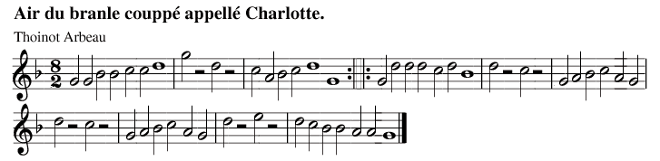
Et avec abcm2ps, sans modification d'apparence :

Abcm2ps
Il s'agit d'un nouveau rendu qui n'a pas les limitations de abc2win. Malheureusement, si on gagne en possibilité (pistes multiples, rendu vectoriel en pdf par exemple), on perd l'apparence d'impression ancienne que l'on avait avec Abc2Win.
Le système est actuellement encore en cours de développement, mais voici le fichier de définition dans son état actuel : renaissance.fmt
- Vous pouvez obtenir les sources utilisables avec FontForge : renaiss_music_font.zip
Et deux exemples de reconstructions :


I'm working on the creation of a font for renaissance music. At the moment, it's possible to use it with Abc2Win. I'm working on it so we will be able to use it with abcm2ps.
I've used FontForge for making this.
Abc2Win
Get all the source for this project (including a True Type font) : abc/renaiss_music_font.zip
Example of use:
From this manuscript: http://memory.loc.gov/musdi/219/0154.gif
  X:32
  T:Air du branle couppé appellé Charlotte.
  R:
  C:Trad.
  S:Thoinot Arbeau
  N:0154.gif
  B:Orchesographie (1589)
  O:France
  Z:http://anamnese.fr.st
  M:8/2
  L:1/2
  Q:1/2=200
  K:F
  GGBB ccd2 | gz dz | cABc d2 G2 :: Gddd cdB2 | dz cz |
  GABc AG   | dz cz | GABc AG | dz ez | dcBB AA G2 ||
Original manuscript:
My transcription with abc2win:
/.../ in construction
Known problems
- Some symbols are still missing : I've only made the most important ones (and some were not used in renaissance music, like trills, mordents,... , so we can forget them).
- Some symbols I've made won't display in Abc2Win : bass key, ut key because only treble key is supported. And the sharp notation refuses to be converted in ttf with PfaEdit. It's maybe the emplacement that causes problem (I can't get again the original flat either), or a bug in PfaEdit. (corrected now)
- Placement of some notes (8th notes), dot of dotted notes...
- Extra lines are not displayed properly. (corrected now, but it's not in the true type, so I can't do better)
- And so are eighth notes which are binded together (so write A/ A/ instead A/A/, and use L:1/2 instead of higher ratio)
- There is no multivoice support with Abc2Win (but there was not either in the partitions of the Renaissance Era)
Abcm2ps
Work in progress.
- Get it there: renaissance.fmt
- You can get the source for FontForge there: renaiss_music_font.zip
Example of use:
Known problems
- flat symbols are drawn rather correctly before notes, but not for key signature for which the symbol is totally out of place.
- the same for sharps, but in addition sharps were supposed to stand below the notes and the staff, which I can really achieve.
- using a script with sed to remove beam by adding space between notes, it's not working for every part. I can't find a command to desactivate beams. Besides it's not really working if L:1/4 for example.
- some symbols are still missing: natural sign, sixteenth note, rests...
- While postscript files are not that bigger than with normal modern notation, the pdf produced are at least 3 times bigger.
- The lines for the staves in renaissance music were printed behind each note : it's obvious on the original Arbeau's manuscript. I was surprised to discover that it was quite the same with Abc2Win : even if it's not for each note, it's for a small range of the staff, unlike Abcm2ps which draw lines independently of the notes. So if it's still look a bit artificial on the ttf font I created, because there is not a small 5lines-staff behind each note but a staff for more or less 2 notes, there is no possibility to make it better with Abcm2ps because it doesn't draw lines that way.
A N A M N E S E
http://anamnese.fr.st
Copyright © 2008 - Droits réservés, site publié sous licence Creative Commons by-nc-nd, sauf les cours linux sous licence BSD ou CC-SA (selon votre préférence)

page générée le 02/02/2026